Forget bold statements or trend-of-the-moment palettes. The real story in Asian interior design right now is a quiet one — five green paint colours that barely read as green at all. Benjamin Moore’s Crownsville Gray, Hancock Gray, Dark Olive and Gloucester Sage, alongside Farrow & Ball’s Vitty Green, have become the default recommendation from Manila to Singapore.
Not because they shout, but because they refuse to. These aren’t the greens you see in a forest or a lime.
They’re muted, earthy, almost grey in some lights. That’s the point. The report notes these shades “read almost like neutrals.” That quality is doing heavy lifting in a region where homes serve as multi-generational gathering spaces.
A colour that dominates a room can wear thin fast when grandparents, parents and children all share the same four walls day after day. The logic behind the popularity runs deeper than aesthetics.
Warm greens like these solve a practical tension. Families want warmth — a room that feels like a hug. But they also want longevity.
A bright accent wall might look sharp in a showroom photo. In a living room used for homework, dinner and evening television, it can grate. These five colours sidestep that problem entirely.
They sit in the background. They make other things — furniture, people, light — look better without claiming credit.
What’s striking is the repeat names. Benjamin Moore appears four times out of five. That’s not accident.
The brand has positioned itself as the reliable choice for this specific niche: green that doesn’t act green. Farrow & Ball’s single entry, Vitty Green, holds its own, but the concentration of one manufacturer suggests a market that rewards consistency over variety.
Designers and homeowners aren’t hunting for novelty. They’re hunting for a shade that works the first time, every time. Look at where these colours get used.
The report mentions colour drenching entire rooms, cabinetry, built-ins, moody backdrops. That’s not a one-wall experiment. These are full-commitment applications.
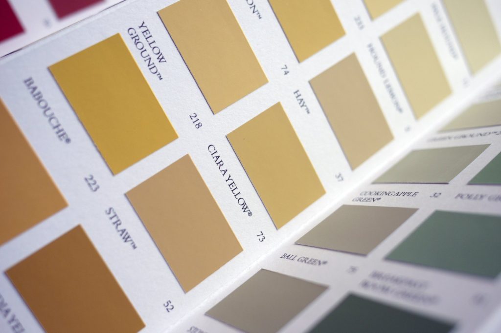
A homeowner painting their kitchen cabinets in Hancock Gray isn’t dipping a toe. They’re betting the whole space on a colour that, on the swatch, barely registers as green.
The bet pays off because the colour’s subtlety absorbs light and activity without fighting it. Where this leads is predictable but worth stating. As more families across Asia adopt these shades, the definition of a “green room” will shift.
Green will no longer mean a statement. It will mean a foundation.
That changes how paint is marketed, how showrooms display colours, how contractors advise clients. The emphasis moves from “look at this colour” to “look at what this colour lets you do.” The force behind it all is simple. People want homes that feel settled.
Not exciting, not daring, not Instagram-ready. Settled. These five greens deliver that.
They are soft, earthy, sophisticated — the report’s own words. None of those qualities scream.
They just sit there, making everything else work. That’s the real news. Not the colours themselves.
The fact that a handful of muted greens have become the quiet backbone of a region’s interior design. And nobody is complaining.
{“@context”: “https://schema.org”, “@type”: “NewsArticle”, “headline”: “Five Muted Green Paint Colors Gain Popularity in Asian Interior Design”, “description”: “Forget bold statements or trend-of-the-moment palettes. The real story in Asian interior design right now is a quiet one — five green paint colours that…”, “datePublished”: “2026-06-23T16:21:00+00:00T09:30:00+00:00”, “author”: {“@type”: “Person”, “name”: “Muhammad Asim”}, “publisher”: {“@type”: “Organization”, “name”: “InfoPulse Today”, “url”: “https://newsfeed.infopulsetoday.com/”}}